How to Mix Oil Paints - The Color Wheel
How to Mix Oil Paints - The Color Wheel
Updated: 08 Jan 2021
Important Intro
Color is just one of painting fundamentals. In order to master painting, it is important to understand the other fundamentals too!
I recommend reading my realistic painting guide first, to understand 8 of the key fundamentals for painting.
In this guide, I will focus on color mixing for oil painting, and the relationships within the color wheel.
When painting, it is highly important to know how to match the right color (hue) AND the right brightness value (how dark or light).
Table of contents:
- Oil paints - characteristics
- Primary colors (blue, red & yellow)
- Secondary colors (purple, green & orange)
- White, black and gray
- Highlights & shadows
- Complementary colors
- Earth colors (Umber, Sienna & Ocher)
- Oil paint types
- Tips, techniques & terms
- Summary & guidance
What are Oil Paints and Pigments?
Light/color:
Light is a collection of energy-particles (photons) that travel in waves.
Sensors in the human eye can detect some wavelengths and the human brain translates different wavelengths as different colors.
When light that consists of all the detectable wavelengths reach the eye, like from looking at the sun or a lamp, the human brain will translate it as white or yellowish white.
Therefore, colors are a characteristic of the human sight, meaning the translation of different wavelengths to different colors.
Pigment:
A pigment is a substance or material that absorbs a portion of the visible wavelengths (light) and reflects the rest.
Chlorophyll, for example, is a pigment that exists in plants and is essential for photosynthesis.
The Chlorophyll pigment absorbs many wavelengths but reflects the wavelengths we translate as green. That is the reason we see plants as if they are green.
In other words, a pigment is a substance that changes the color of light by selective absorption of wavelengths.
Oil paints:
Oil paints are pigments (dry powder), mixed with a binder, usually linseed oil.
Oil based paints do NOT dry; they become solid. When linseed oil meets oxygen from the air, the process of oxidation begins (absorption of oxygen atoms) and polymerization (oil molecules react to form polymers, which are huge molecules).
Oil Paint Characteristics
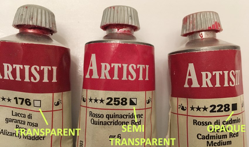
Opacity: Transparent vs Opaque
Different oil paints have different levels of opacity.
Oil paints labeled as opaque will cover the canvas completely.
Oil paints labeled as semitransparent or transparent will cover the canvas (or an under layer of paint) partially.
- Full square mark means opaque color.
- Semi-full square mark means semitransparent color.
- Clear square mark means transparent color.
Warm and Cool Colors
- Red, orange and yellow are warm colors; they bring to mind warm stuff like the Sun or fire.
- Green, blue and purple are cool colors; they bring to mind cool stuff like the ocean or wet grass.
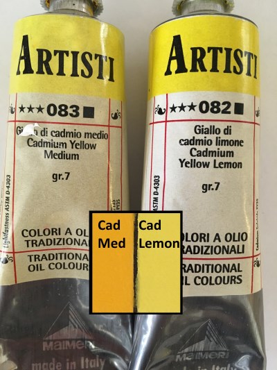
Most oil paints are not pure colors, but a bit warm or cool.
For example: Cadmium Yellow is a warmer yellow because it is a bit orange, while lemon yellow is a cooler yellow because it is a bit greenish.
Another example: Cadmium red is a warmer red, meaning it is an orange red, while quinacridone red is a cooler red because it has a purple tinge.
 Warm cadmium vs cool lemon
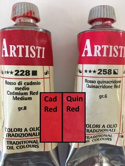 Warm cad vs cool quinacridone
In essence, yellow, for example, will always be warm but some yellow colors will be warmer while other yellow colors will be less warm.
THE COLOR WHEEL: Primary Colors
There are 3 primary colors:
- Blue
- Red
- Yellow
A primary color is a color that cannot be mixed from other colors. Therefore, it is necessary to buy all three primaries.
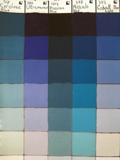
Blue & Azure Pigment
Blue oil paint can be:
- With a purple tinge, like in the case of ultramarine blue.
- Neutral, like in the case of cobalt blue.
- With a green tinge, like in the cases of cerulean blue, phthalo blue and Prussian blue.
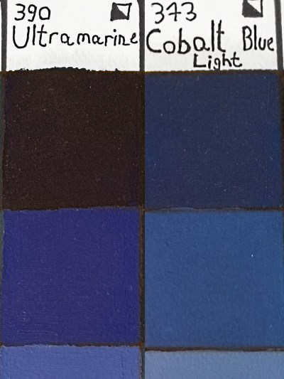 Purple tinge Ultramarine blue
Neutral Cobalt blue
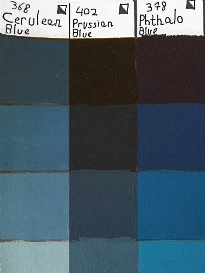 Blue oil paints with a green tinge:
Cerulean, Prussian and Phthalo
In the next example, I used Prussian blue for the background:
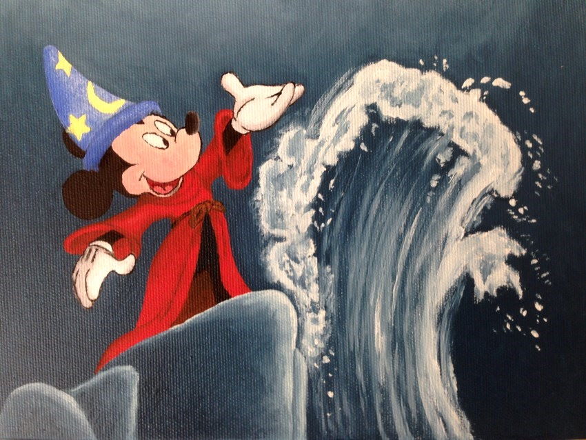 Mickey Mouse, Fantasia (1940 film)
*Phthalo blue is a staining color, meaning even after washing the brushes, they will stay with a greenish blue tinge. It is a dominant color and it has a very strong scent.
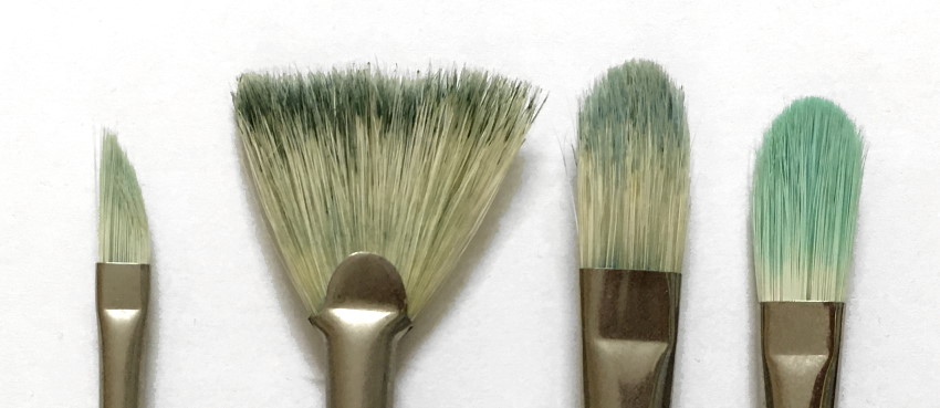 Stained brushes
*Azure (Sky blue) is a mixture of blue and white pigments.
If you want to know more on paintbrush types, visit my guide on brushes for oil painting.
Red Pigment
Red is a dominant color and therefore it is used for important traffic signs. In text, red symbolizes warning.
Since red captures the attention of the viewer, it is best to use it sparingly (in landscape paintings) for parts in the painting that are far (so not to "bring them forward").
Pink is a mixture of red and white pigments.
Peach is a mixture of pink and a bit of yellow.
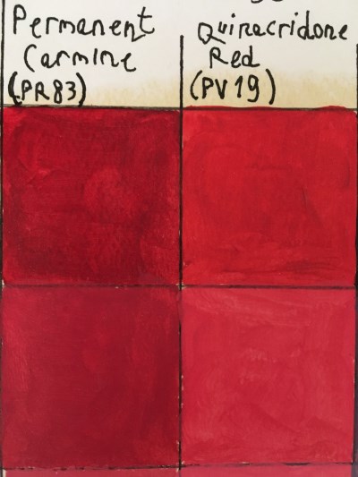 Cool red oil paints
Alizarin crimson & quinacridone
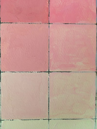 Pink color palette
Mixture of red and white
Yellow Pigment
Yellow is a bright color, which is sometimes used for brightening other colors.
Yellow ochre (also ocher) is one of the ancient earth colors and it has many uses. (More on that later).
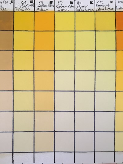 Yellow oil paints palette
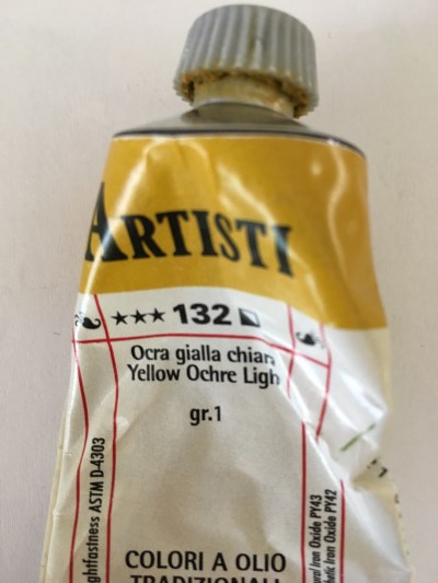 Yellow Ochre oil paint
THE COLOR WHEEL: Secondary Colors
There are 3 secondary colors:
- Purple
- Green
- Orange
You can use the 3 primary colors to mix the 3 secondary colors:
- Mixing blue and red creates purple.
- Mixing blue and yellow creates green.
- Mixing red and yellow creates orange.
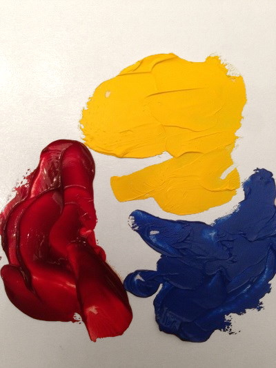 The 3 primary colors
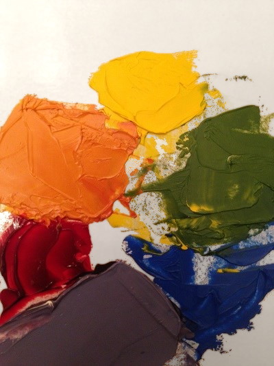 Mixing the 3 secondary colors
Purple Pigment
Purple is the mixture of red and blue.
Cool red oil paints, like quinacridone or alizarin crimson, are best for mixing purple. Warm red oil paints, like cadmium red, will produce brownish or grayish purple.
Quinacridone is more durable than alizarin crimson and is therefore recommended for use.
 Mixing red and blue makes purple
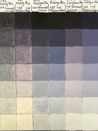 Purple oil paints palette
Good to know:
Purple color can be very dark. Adding a bit of white will make it lighter.
Green Pigment
Green is a mixture of blue and yellow.
Mixing black and yellow will produce a khaki green.
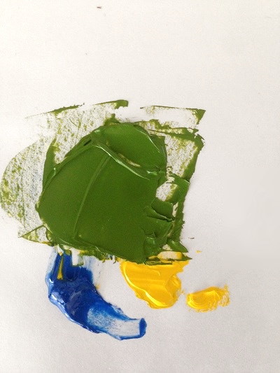 Yellow and a bit of blue
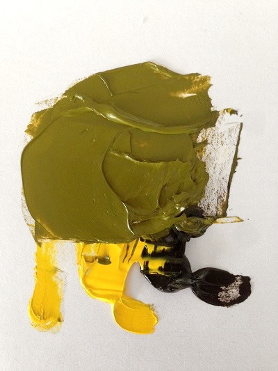 Yellow and a bit of black
Important:
When mixing ANY color, we choose the pigments we want to use AND the amount of each pigment.
By playing with the amount of each pigment, we can create many color variations.
In the next example, I used blue (cerulean) and yellow (lemon) to mix green. For one mixture, I used more blue for a cool green. For the second mixture, I used more yellow for a warmer green (still cool though):
 More blue vs more yellow
Yellow ocher pigment is great for mixing many types of green, depending on the amount of ocher we use and the blue pigment we pair with it.
 The use of yellow ocher for mixing green colors
Orange Pigment
Orange is a mixture of red and yellow.
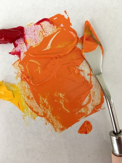 Red and yellow mixed
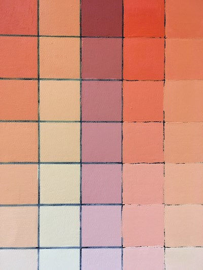 Orange oil paints color palette
Orange (and other earth colors) mixed with white can be used as a basis for skin tone.
For less saturated orange, add a bit of the opposite color (blue) to the mixture.
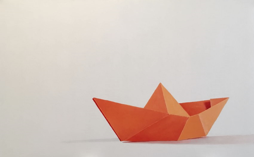 Still life oil painting, 80/50cm: Origami boat. Quinacridone red & cadmium yellow.
Colors with high saturation:
There are some cases in nature (like specific flowers under a strong light) or in objects which are man-made that have high saturation. Meaning, sharp and rich colors.
Tubes of primary colors (red, blue, yellow) are saturated enough.
In specific cases, for secondary colors (purple, green, orange), the color cannot be mixed from other colors with enough saturation.
Therefore, buying a specific oil paint tube is the only solution.
These specific colors can be regarded as primary colors, since they too cannot be mixed.
THE COLOR WHEEL: White, Black and Gray
White Pigment
White pigment does not absorb any wavelength (color); it reflects them back. Since all the other colors absorb some wavelengths, they cannot be used to mix white. Thus, it is necessary to buy white oil paint.
White is an important color and the main color for lightening other colors.
Pure white is rarely seen in nature, due to reflections and other factors. In most cases, it is best to avoid the usage of pure white while painting (except for rare cases with strong highlights).
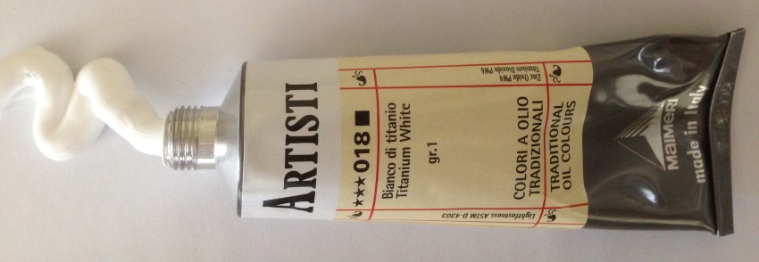
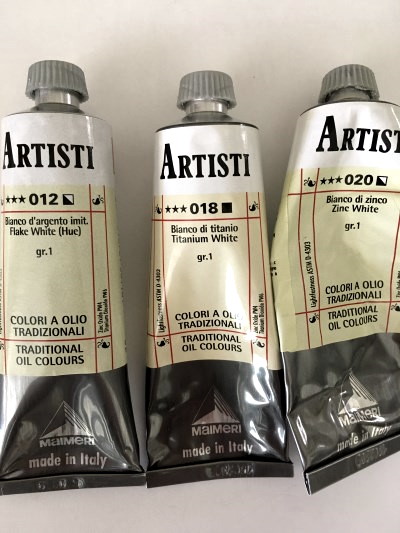
There are three main white oil paints that are composed of two pigments: Titanium (PW6) and zinc (PW4).
- Titanium - An opaque white, which is great for covering and for mixing colors.
- Zinc - A semitransparent color, great for glazing, mostly cool, depending on the brand.
- Flake - A semitransparent color, great for glazing, mostly warm, depending on the brand. Replaces the toxic lead white.
 The 3 main white oil paints:
Flake, titanium, zinc
 Blue oil paints palette:
Adding white for lighter values
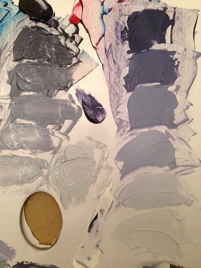
Black and Gray Pigments
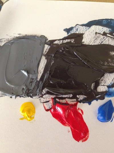
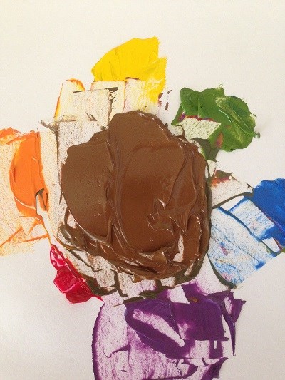
Black is the darkest color. It absorbs all wavelengths. There are many ways to mix black from other colors.
Mixing all 3 primaries (~x yellow, 2x red, 4x blue) will create black. That is like mixing a very dark purple and then adding a bit of the opposite color, yellow.
Ultramarine blue mixed with burnt umber is a cheap and fast way to create black. Most brown or orange oil paints can be mixed with most blue oil paints to form different blacks.
Gray is adding a bit of white to black. A bit more brown will create a warm gray, and a bit more blue will create a cool gray.
 All 3 primaries mixed together
Adding white to create gray
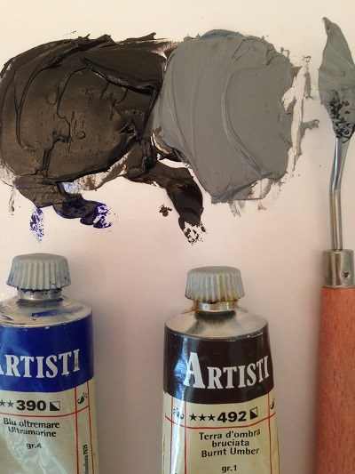 Ultramarine blue & burnt umber
Adding white to create gray
Something to consider:
While all colors reflect different amount of wavelengths, black absorbs all and does not reflect anything. This can look a bit strange on a painting, as if there are "holes" in the painting where black is painted.
The solution is to mix black paint from other colors and not to buy black oil paints, even though they are very cheap. It is a matter of personal preference.
That said, using black when mixing colors will make these colors less noticeable, so other areas of the painting will be in focus.
Highlight and Shadow
Every object is made of pigments, which define its color.
The area of an object that is in front of a light source is called highlight and the area that is hidden from the light source is called shadow.
Highlight:
The highlight area can be lighter, brighter or both.
For light color, which is less saturated, we add white to the mixture.
For bright color, meaning saturated color, look at the color wheel and add the next color toward yellow.
- For purple, add red or blue.
- For blue, add green.
- For green, add yellow.
- For yellow, add white.
- For red add, orange.
- For orange, add yellow.
Often, highlight means light AND bright color.
Shadow:
For the shadow area, it is possible to add a bit of the opposite color in the color wheel.
Adding the opposite color, will darken the color and make it less saturated.
- To orange add blue and vice versa.
- To green add red and vice versa.
- To purple add yellow and vice versa.
Opposite colors are pairs of primary and secondary colors. A secondary color is a mixture of 2 primary colors. Therefore, mixing opposite colors is a mixture of all 3 primaries.
Mixing all 3 primary colors will absorb most of the wavelengths and will result in a darker color.
Note:
Using the opposite color in the color wheel is a shortcut for mixing shadow area colors. In reality, the shadow is influenced by a multitude of factors.
Highlight and shadow summary:
When drawing and painting nature in a realistic style, the objects will be less saturated.
Some flowers under a certain climate or some man-made object will be very saturated.
For most paintings, all the colors, including highlights and shadows, can be mixed from the three primary colors and white.
For special cases of saturated objects, under a certain light, a tube of a specific oil paint might be needed.
We use observation, knowledge and experience to mix the accurate color.
THE COLOR WHEEL: Complementary Colors
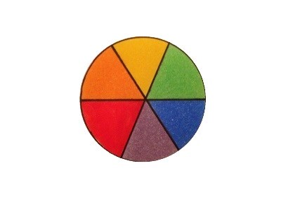
The color wheel is an arrangement of colors around a circle, which enable to see the relationships between the three primary colors and the three secondary colors.
Opposite colors cancel each other when mixed, forming a brown or grayish color.
The opposite color for each color in the color wheel, which can be used to mix shadow color, is also the complementary color.
Complementary colors, when painted next to each other, form the strongest contrast and look well together.
Painting a red apple, for example, will look well with a green background.
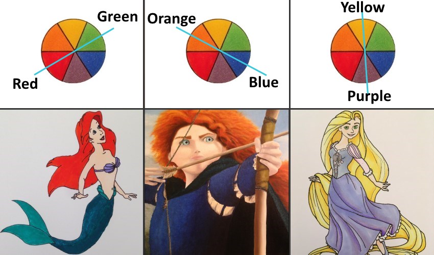 Complementary colors used by Disney
Leonardo da Vinci noticed that some pairs of colors produce the best harmonies.
There was no scientific explanation for that until some two hundred years after his death, when Sir Isaac Newton, in his research on optics, created a wheel that shows the colors of the spectrum and that the opposite colors create the most obvious contrast.
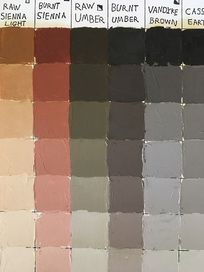
THE COLOR WHEEL: Earth Colors
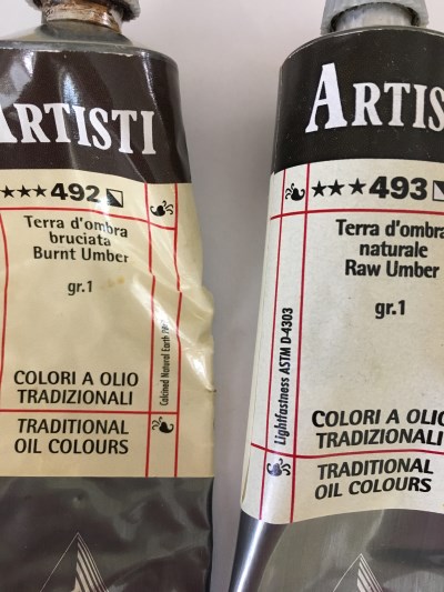
Earth colors include three main pigments: Umber, Sienna and Ocher.
Umber comes as Raw Umber or Burnt Umber.
Sienna comes as Raw Sienna or Burnt Sienna and has a red or orange tinge.
Yellow Ocher pigment is also associated with the yellow family.
These pigments are suitable for landscape painting, hair painting and more.
 Raw Umber & Burnt Umber
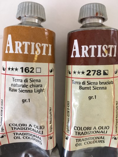 Raw Sienna & Burnt Sienna
All earth pigments contain iron oxide. In addition to iron oxide, Umber and Sienna pigments contain manganese oxide.
Oxide is a compound, of a substance or an element, with oxygen. Iron oxide is the reason for the red-brown color of rust and the red color of blood.
Earth colors are the oldest and most durable pigments. Today, earth colors also exist as synthetic pigments.
The 3 main earth pigments:
PY43 (Pigment Yellow 43)
Pigment representing natural yellow ocher and natural Raw Sienna.
Pigment PY42 represents the synthetic alternative.
PR102 (Pigment Red 102)
A pigment representing natural Burnt Sienna and many more browns and reds such as Mars Brown, Terra Rosa and Venetian Red.
Pigment PR101 represents the synthetic alternative.
PBr7 (Pigment Brown 7)
Pigment representing natural Burnt Umber, natural Burnt Sienna and many other browns.
Pigment PBr6 represents the synthetic alternative.
How to Mix Brown
In addition to earth colors, it is possible to mix brown color from other colors.
Mixing the opposite colors of the color wheel will result in brown. Adding a bit of the opposite primary color to the secondary color: a bit of blue to orange, a bit of yellow to purple or a bit of red to green will result in brown oil paint.
Another way is to mix all 6 primary and secondary colors together to form a basic brown. From that basic brown, it is easy to mix the other brown colors. Adding a bit of red to the basic brown will create Burnt Sienna, adding a bit of yellow will create Yellow Ocher and so on.
 Mixing all 6 colors
 Mixing orange with a bit of blue
Something to consider:
Since earth pigments are cheap compared to the primary colors, it is advisable to buy brown oil paint and not mix it.
Oil Paint Types
Oil paints are usually a mixture of oil with a single pure pigment or a mixture of several pigments, but there are other types:
Hue:
The mark Hue on a paint tube means that the specified pigment is NOT the actual pigment. In some cases, when a specific pigment is toxic or expensive, a combination of other pigments can produce a similar result in a safer or cheaper way.
A good example is the Lead or Flake White, which was toxic and is produced today from safer pigments, but keeps its name with the addition of the word Hue; i.e. Flake White (Hue).
Lake:
The mark Lake on a paint tube is the use of dye, which was made solid instead of ground minerals for example. In some cases, these oil colors will be less lightfast*.
*Lightfastness of a pigment or a dye means how resistant it is to direct light and how long it will be before the color will start to fade.
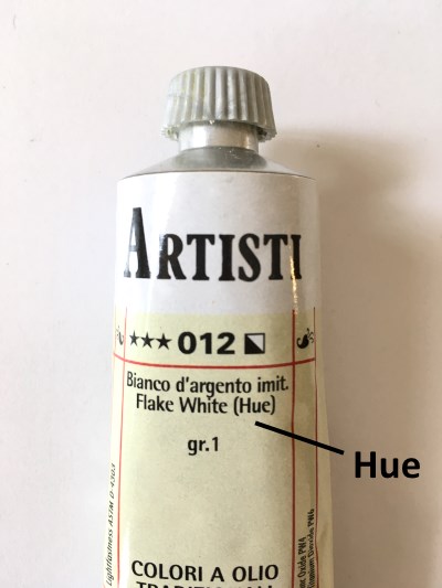 Hue
Hue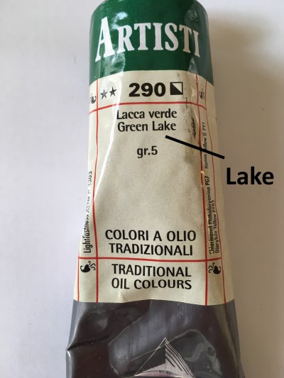 Lake
LakeFor a quick supply guide, visit my oil painting supplies for beginners.
How to Choose Oil Paints
Most of the leading brands of oil paints hold at least two grades of colors:
- Student grade - Colors with more filling material besides pigments and oil. Therefore, their price is cheaper. These oil paints are good for practice.
- Artist grade - Artist-level oil paints are more expensive because the amount of pigments in them is greater.
Which brands of oil paints to choose from:
The main importance when painting with oil paints is the ability and knowledge to mix the right colors and the correct brightness level. There is less importance to the brand or type of pigment; it is a matter of personal preference.
I use and recommend the Maimeri Artisti (artist grade) oil paints.
Keep in mind:
When opening a new tube of oil paint, if there is oil leaking on the work surface, it is, usually, a good sign. That means there are only pigments and oil in the tube.
Some brands add a binder to the mix, which makes the oil paint less runny and therefore solvents/thinners should be added which is less idle.
Tips, Techniques & Terms
How to Paint in Layers
Fat over lean principle:
Thinners or diluents are evaporating materials.
Mixing oil paints with a thinner makes them harden faster because there is less oil in the mixture.
When painting in layers, each new layer will have a bit more oil and a bit less thinner.
A new layer may slightly block the air for the lower layer and thus slow down its hardening process. In this situation, the upper layer will harden before the lower layer and when the lower layer hardens, it may damage the hard top layer and crack it.
The top layer should be fat, meaning with a larger amount of oil thus harden slowly. The lower layer should be lean, meaning less oil and more thinner, making it harden faster.
In addition, there is a claim that a larger amount of oil will cause the layer to be more flexible and therefore less likely to crack.
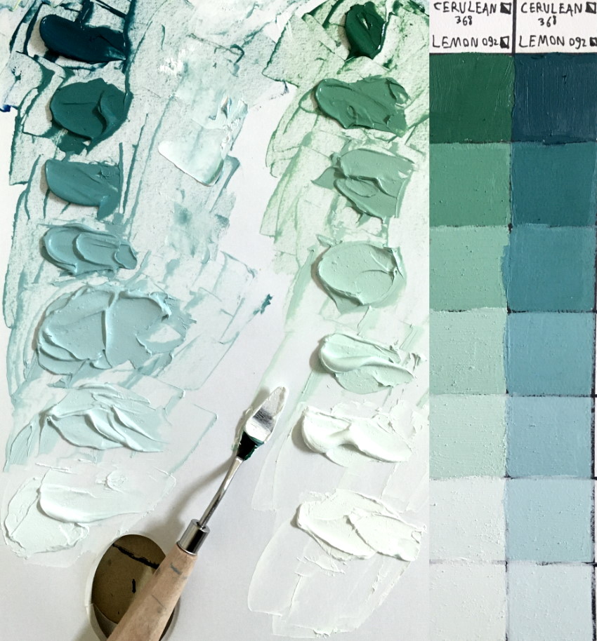
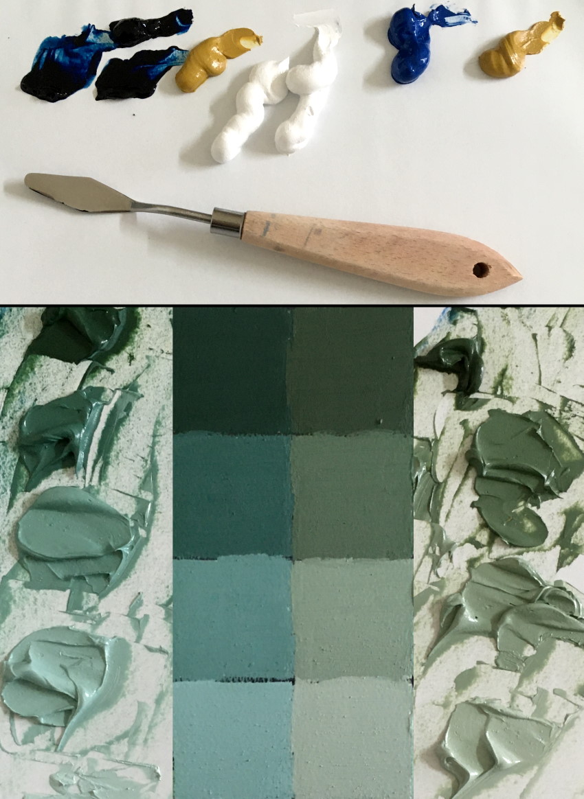
Color Palettes
Color palettes can be prepared in advance for future reference and usage.
Each pigment should be mixed with an increasing amount of white pigment to create lighter versions.
Each 2 pigments should be mixed with one another and then, with an increasing amount of white to create different degrees of brightness.
The color palettes should be made from a material that is suitable for oil paints.
 One pigment and white
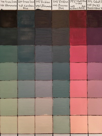 Mixture of 2 pigments & white
An example for creating color palettes by the painter Thomas Baker:
For more information on color mixing, I created a list for some of the best YouTube painting instructors.
Basic Terms for Color Theory
- Hue - The name of a color family, i.e. red, green, blue and so on.
- Saturation - How pure or intense a hue is. I.e. how bright or dull it is.
- (Brightness) Value - How dark or light a color (hue) is.
- Temperature - How warm or cool each color is.
- Shade - Mixing different amounts of black color with a certain hue creates different shades.
- Tint - Mixing different amounts of white color with a certain hue creates different tints.
- Tone - Mixing different amounts of gray color with a certain hue creates different tones.
Note: Different artists or color theories use these terms quite loosely or in a different way.
For example, lightness, sometimes, refers to value or tone.
Summary
How to start:
One way is to use the 3 primary colors, brown and white.
With these 5 colors it is possible to mix most colors and shades.
When using a limited palette (red, yellow, blue, brown and white), white and yellow are used for lightening colors while brown and blue are used for darkening colors.
How to mix colors:
Mixing oil paints means to find the correct hue AND the correct brightness value. That is to say how bright or dark the color mixture is compared to the brightness level of the observed object.
When dark or light colors are added to the mixture, the brightness values will change, and should be adjusted again until both the value and hue are accurate.
In addition, we want to pay attention to saturation. A paint straight from the tube can be very saturated (depending on the pigment). We might need to bring down its intensity.
Colors can be pre-mixed with a palette knife or mixed with a paintbrush while painting.
Color comparison:
When painting an object from observation or using a printed image, it is useful to hold a paintbrush or a palette knife with the mixed oil paint and, place it next to the object or the reference image and check if the brightness level and hue are the same.
This will not work when comparing colors against a computer or TV screen because these devices have their own lighting that is different from the studio light.
It is a good idea to draw the color wheel (or print a picture of it) that will always be available.
Time spent on color mixing:
Mixing oil paints takes time.
For some painters, especially in a realism or impressionism painting style, mixing colors will be the main work and time spent compared to actual painting.
Oil paints and toxicity:
There are some toxic pigments, such as cobalt and cadmium, and it is best to use gloves in some cases. Hands should be washed before touching food.
Where to go next?
From my experience as a painter and an art instructor, I recommend learning to draw before (or while) learning to paint.
Drawing or painting is creating an illusion. The world is three-dimensional but our canvas or paper is two-dimensional.
To create that illusion we need to learn depth. Here is my guide on how to draw depth, with 15 proven methods, and many examples.
In addition, you might be int


Comments
Post a Comment