Other than highlights around the nose, Them’s Fightin’ Words by William Schneider features clearly unblended strokes.There’s some debate in the pastel world as to whether pastels should be blended, left unblended or be some combination of both. Renowned pastelist William Schneider has found using a combination of unblending and blending pastels gives his work greater variety, softer edges and more unified areas of light and shadow.
Pastels: Perfect for Portraits and Figures
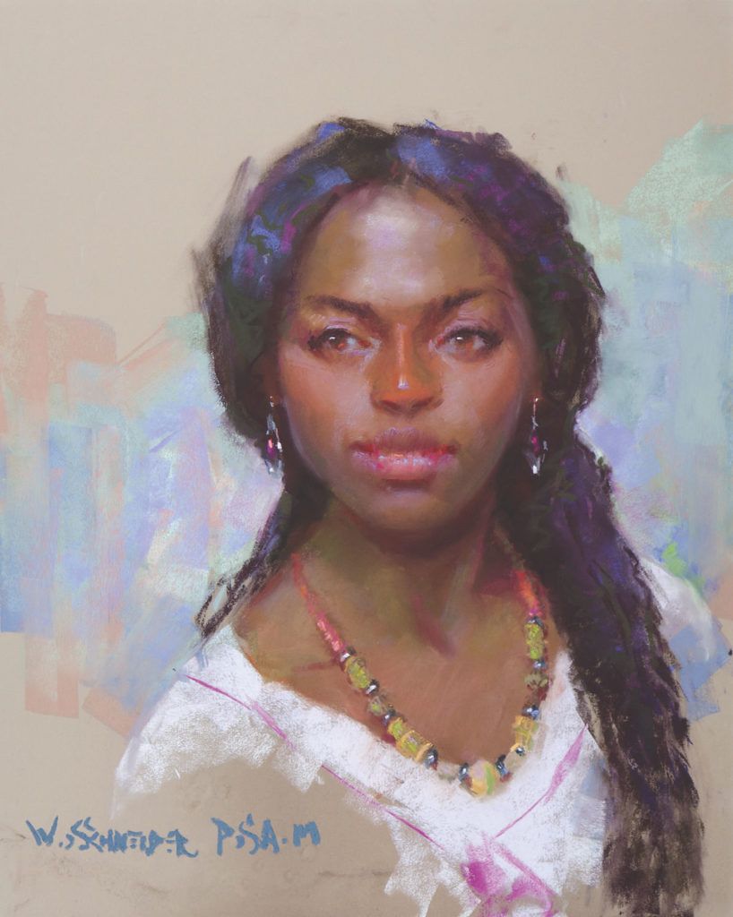
One of the greatest benefits of pastel is that it mimics the nature of flesh itself. Skin is translucent, so we see into it. The ivory bone close to the surface in the forehead or the bridge of the nose shows through. In some skin tones, we see the pinkish color of the capillaries in the nose and cheeks. We see the subtle cool violet caused by the veins near the surface below the eyes. If you overmix these complementary colors in oil paint, you’re likely to get a grayish mud. However, blending those same colors in pastel leaves microscopic particles of pigment lying next to each other on the painting surface. The resulting vibrations enhance the illusion of light on skin. In addition, when you place the highlights as unblended strokes, they read as light reflecting off the surface of the skin.In Mandella by William Schneider, the sharp highlights make the eyes appear in focus even though the edges are very soft.Another positive is that blending pastels pulls together large areas of light and shadow. This simplifies and unifies the painting. What’s more, an added benefit of blending pastels is that the few untouched strokes stand out when contrasted with the softly blended areas behind them. This visual variety adds impact. Schneider shares a portrait demonstration, below. Follow along to see how he uses both blended and unblended pastels to achieve a sultry image defined by light and shadow. Enjoy!
Demonstrating the Magic of Blending Pastels in Portraiture, Step-by-Step
Step 1: I placed broad strokes of the colors I observed in the model and blended them on the face.Step 1Step 2: I blended the rest of the tones, drew the model using vine charcoal and placed marks to indicate the extremes: lightest light, darkest dark, sharpest edge and most intense color.Step 2Step 3: Next, I covered the rest of the support with broad areas of color and began to render the shadow pattern.Step 3Step 4: I refined the painting, still blending most strokes to create soft transitions. Note the unblended highlights on the lips and jewelry.Step 4Final Step: I completed Reckless Abandon by leaving key strokes unblended. These include highlights on the dress, details on the scarf around the hips, and highlights on the eyelids and lips.Reckless Abandon by William SchneiderLearn more of Schneider’s thoughts on blending, as well as the tool(s) he finds work best for getting the job done, in this issue of Pastel Journal.
Bonus Tip: Preparing Your Surface
The right surface makes all the difference for your pastel strokes. Watch this quick tutorial to see how artist Christine Ivers prepares her painting surface.
Discover more of Ivers’ pastel tips and techniques in the Pastel People, Places and Scenes Collection. Including four video workshops on how to paint different types of scenes and essential techniques to use, this bundle will educate and inspire you to start creating your own pastel artworks like a pro.
Art Material Glossary Facts in books, information in glossaries, the ability to use them in our heads! If you are new to the arts you may have problems to decipher certain art material terms used in the arts field. Or you wonder what brand to get. To help you along, I added this little glossary as a guideline to make it easier to find the right materials when starting to draw or paint. Save Drawing Materials GRAPHITE PENCILS There are varied types of graphite pencils. When you buy a set, make sure that you get one with a 4h and 2h otherwise buy them single. All brands are really fine. I personally use the Faber Castell graphite and Staedler pencils. Staedler is cheaper and a little lighter than the Faber Castell. Faber Castell are the only pencils with an added inner core strength so that the pencils don't break inside when they fall. SKETCHPAD The paper we draw on is of importance. In my time as commercial illustrator I tried man...
Learn How to Draw a Dog with This Simple Step-by-Step Sketching Guide By Sara Barnes on September 4, 2019 How to Draw a Dog Body Step by Step The easiest way to start drawing anything is to break it down into its simplest form and then gradually refine its details. This makes even the most daunting subjects accessible. Photo: Jamie Street For this exercise, you’ll want to find a photo of a dog. Generally, it’s best to draw from life whenever possible—it helps keep your observation skills sharp. But for a subject like a dog, which moves a lot , opt for a still image instead. STEP 1: STUDY YOUR SOURCE PHOTO. Photo & art: Sara Barnes / My Modern Met Just because you aren’t drawing the dog from life doesn’t mean you’re free of observation. In fact, a photograph gives you even more opportunity to study your subject. Before putting pencil to paper, take time to look at your photo. Start to note all of the things you see. How are the legs...
STEP BY STEP OIL PASTEL PORTRAIT USING SCRAPING TECHNIQUE March 12, 2020 Team Camlin Articles Leave a comment Want to try your hands on a simple, yet interesting way of creating portraits? We have something special for you! Here’s a quick guide on how you can create a quick portrait with an easy Scraping Technique using Camlin Oil Pastels. What you will need: • Board • Camlin A4 Size Drawing Paper • Double Sided Tape • Camlin Oil Pastels & Scraping Tool Step 1: Take a blank A4 size Camlin Drawing Paper and tape it onto a board for support, with a Camlin Oil Pastel box and Scraping Tool by your side. Step 2: Grab some bright oil pastels from the wide number of shades available in the Camlin Oil Pastels box and start colouring various patches to create a colourful and vibrant base. Step 3: Using the black Camlin Oil Pastel, add a layer of black colour on the base colours, and keep colouring until you cover the whole paper. Step 4: It’s now time t...


Comments
Post a Comment